Welcome to the wonderful world of creating your website using Church360° Unite! Feeling some pressure? Don’t. You can do this. I promise you, with a little guidance you’ll be sailing through and wondering why you ever worried in the first place.
In this series of articles (we’ve dubbed “Unite Basics”) you’ll learn the easiest way to make an attractive website for your church with the least amount of headache.
The best part is that you need no design training, don’t need to know how to code, and don’t even need to know the language. Think of this as your map. Follow it and you’re sure to come out alive!
Let’s begin with the part that will take the longest: Content and Navigation
Any website can have great design, but if the content is lacking and it’s hard to find the information you need, what’s the point? It’s just like books; you might find one with a really beautiful cover but if it’s not a good book no one is going to read it.
Content
The best part about a site you manage yourself is that it can grow as you need it to, so don’t worry if not every group or committee has given you their text, you don’t have all your staff bios done and not all the pictures you need are taken. Those pages can easily be added later. What you should start with are the most basic pages that both your visitors and members might need. Here’s a short list:
- Contact information
- Address and/or Directions
- Service times and whether there is bible study
If you want, all of that could even fit on one page. It sounds too easy to have just that, doesn’t it? Well, that’s just to make sure people can find you right away and make it to service on time – which is what any church could hope for. You might also want to add a welcoming note saying that the site is being built and to check back for new pages to come. Once you’ve got those essentials up, you can start filling in the details:
- What we believe: This page should have information about what denomination your church belongs to, what you believe about God, communion, baptism, etc.
- What to expect: For visitors not to feel completely out of place when they walk in, a page like this is very helpful. Tell them what the worship style is like. Do you sing hymns out of a book or do you use a projector? Is there a praise band, organist, or do you sing unaccompanied? What sort of clothing do most people wear? Can they come in blue jeans or should they dress up a little more? Tell them where to park, if there’s social time after the service, of if there is a place to take fussy children. Tell them what you would want to know if you were visiting a church.
- Calendar: There is a calendar page built right into Unite that you can either fill out yourself or can pull information from your Church360° Members calendar and Google calendars. You can make this visible to everyone or just members. If you’ve got a busy congregation, having this information can be a huge timesaver – especially if you’re the one answering the phones.
- Members: This is your built-in, members-only directory that can pull information from Church360° Members, Shepherd’s Staff, or you can fill in on your own. Only people who are signed into the website will be able to see it, so your members can contact each other or update their information as needed. Again, HUGE time-saver.
You may want to add or take away from these lists, and that’s fine. It’s up to you to decide what the most important information to have is – and then make those pages right away. You might think a Newsletter or Staff page is more important than the “What to expect” page. The take-away here is to prioritize so you don’t get bogged down in the details.
A little more on content. As a person who likes to bite off way more than I can chew, a few guidelines to help you relax and enjoy the process:
- You don’t have to write a novel on each page. People like to skim for information so make it easy to find.
- You do have to write something or it seems impersonal. Aim for at least 250 words on each page. Believe me, that’s easier to do than you think and it makes an impression.
- Proof read. Proof Read. I can’t say it enough. PROOF READ. Someone will see that insignificant typo and they will point it out. If you’re the one who builds the bulletins this is not a surprise.
- Use the “draft” option. If there is a bunch of information just trickling in, make those pages, add the information, but keep it as a draft. No one sees anything until you publish it.
- Think about yourself. Are you in charge of maintaining the site and all its content? How often are you really going to have time to do this? If you’re a busy person (and you probably are) think about whether you’re going to be able to update once a day or once a week. Maybe once a month sounds more likely. Just be honest with yourself and others. It will help everyone out in the end (especially you!).
Navigation
This part is much shorter, but just as important – especially as your site grows. Rearranging pages every now and then is fine. Having to do it all the time? That’s just a headache. Again, the key here is to prioritize. What is the most basic information everyone is going to need at some point? Make sure those details are right up front and easy to find – they’ll thank you for it (just maybe not out loud).
So, where do you start? Make another list! Lists are the best for putting things into perspective. What content did you decide was most important? Put those pages first on the list. Now add the pages that were secondary, but still important. Follow those with any groups, committees, and pages that are useful, but maybe don’t need to be right out front. Again, this list will depend on your church and may look nothing like the list for another church. That’s fine. Do what fits (and will benefit) your church. Need a little more guidance? Make two lists instead of one:
- List one: What we have. This list is pretty straight forward. What have you got right now? Are they just the basics listed in the Content section? That’s great! Add what you’ve got. Remember – everything can be rearranged as your site grows. You aren’t married to anything at the beginning.
- List two: What we will have. In this list, write down all the groups, pages, committees etc. that will need or want a place in the website. You can be generous here. The idea is that your site will be growing, so it’s good to have a general plan on where to put future details. As your site grows, these things might change. That’s OK. The plan can adapt, but you’ll be prepared. Extra pages can hang out in the “Available Navigation” list just as long as they need. Pages can be drafts indefinitely. No one has to see them but you.
Now that you’ve got some idea of what you’ll be organizing, things should go quickly. There isn’t a set number of pages or categories you have to have. If three pages is all you need, have three pages. There are, however, a few things you might want to keep in mind:
- Number of Categories: Most (not all) Unite themes allow for 7-8 pages or categories to fit on your menu before things start to look off. If you’re using one of the mobile-friendly options, you might want to go even fewer.
 Too many menu items.

A good amount of menu items.
- Types of Categories: While making your lists, group things into possible categories. Maybe you have a lot of organizations (like LWML, Evening Guild, Worship Team, Youth Group, etc.). That’s great! Try to sort them by categories like “Get involved” where you list all the groups or pages for people to get involved with the congregation. You might have groups or pages about ways to serve the church or community and you could make a category called “Ways to Serve” with those pages in it. What you decide will depend on what you have.
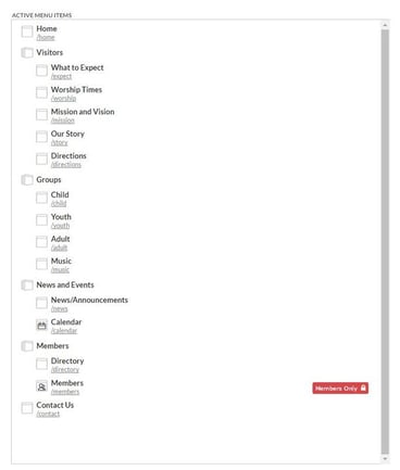
- Sort Your Categories: If you’re finding that you have a lot to tell prospective visitors, or maybe pages that only members should see, sort those. It’s fine to have a category named “Members only” or “Visit us” and will make it so much easier for people to find what they’re looking for.
 Hide Certain Categories: Use the “members only” tool to hide things visitors just don’t need tosee. Committee pages and groups that are closed to non-members would fall into this category.
- Most Importantly — Connect People: Websites are to get people in the door and help them find information, but it’s not a replacement for your amazing congregation to make real connections with real people. Think of a website as a snapshot of your church – not just the building, but the people. Show them something they want to be a part of.
That’s it! Maybe it seems easy, maybe it still seems a little daunting. I hope it doesn’t. Pull out that pencil and paper. Start writing. Make a plan. It’ll carry you farther than you think!
Here’s a quick recap to take away:
- Figure out what information your website should have based on who you want to serve
- Decide what information is most important and get that out first
- Have an idea for how your website might grow – but focus on what you have now
- Keep your navigation simple by sorting pages and making them easy to find
- Keep your navigation clean by using categories and the “Members only” tool
- Be realistic about what you can do and be honest with everyone about it
- Things might change and that’s OK
- Your website represents your church only
In our next article, we’ll be diving into the (much easier than you think) world of color!
Learn more Church360° Unite by subscribing to the prouct updates blog!


 Hide Certain Categories: Use the “members only” tool to hide things visitors just don’t need tosee. Committee pages and groups that are closed to non-members would fall into this category.
